The revamped brand, website and visual identity will support the company’s next phase of growth
Recent years have been exceptionally challenging for the house-building industry. Fluctuations in demand, rising interest rates and market uncertainty have put the entire sector under strain. Despite this, Mammuttihirsi has continued its determined development and strengthened its position in the market.
The company is now taking the next step in its growth story and rebranding as Mammut. Along with the name change, the company’s visual identity, website and marketing materials are also being revamped.
– We’ve been known as Mammutti in everyday speech for a long time, so we wanted to adopt the name officially in all our communications as well. At the same time, we’re focusing more strongly than ever on building our brand. A shorter, clearer and more memorable name supports our objectives both at home and, in the future, on international markets as well, says the company’s CEO, Ilpo Nylander.
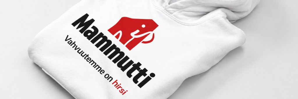
The Finnish landscape as inspiration for a new look
The most striking aspect of the rebranding is Mammut’s new visual identity, which was designed by art director Janne Peltoniemi.
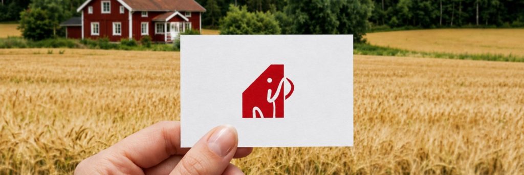
The brand’s visual identity is built around elements familiar from the Finnish landscape. The colour palette features the soft hues of fields, the vast sky, the greenness of nature, and a red based on red ochre, which serves as the recognisable main colour of the identity. The idea is a view that many Finns will recognise: a home in the midst of an open landscape, a place that is lovely to visit and even lovelier to return to.
The new logo combines the name ‘Mammut’, the construction industry and the company’s distinctive visual identity. Its simplified design features the silhouette of a mammoth, the letter ‘M’ and a reference to a house with a pitched roof.
– The aim of the new brand identity was to combine Mammut’s long history and strong expertise in log construction with a modern, timeless look. We wanted to create a recognisable brand identity that conveys quality, reliability and strength. The new logo and colour scheme also support this concept. The main colour, red, is inspired by Finnish red ochre, which reflects the company’s roots, history and building traditions, whilst also helping Mammut to stand out and remain memorable in the future, explains Peltoniemi.
The revamped website enhances the customer experience
As part of the brand revamp, Mammut’s website has also been redesigned.
The new website places particular emphasis on clarity, the presentation of properties and a seamless customer experience. The aim is to make it easier to find information and to make it even more straightforward for both new and existing customers to explore Mammut’s services.
The revamped look will first be visible on our website and social media channels. Over the summer, it will also be rolled out in stages across other materials, events and customer interactions.
– Although the name is changing, the core of our business remains the same. We will continue to produce Mammutti logs, Mammutti log houses and Mammutti installations. Our products, service packages and the quality and customer satisfaction that are so important to us will not change. Above all, this rebranding reflects the fact that we are looking firmly to the future and laying the foundations for Mammutti’s years to come, says Nylander.
Further information: